 Last week I reported that Pinterest is ranked among the top 30 most popular U.S. websites. Then, it was still the sweetheart of the tech industry and quickly adopted by photographers, artists, social networking users, marketers and pretty much anybody who engaged with it.
But just a few days later after my report and its glorious status, Pinterest announced it is redesigning the users profile page.
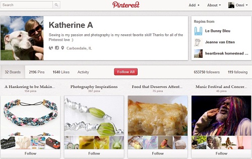
Before I’ll get into the reactions from Pinterest’s community, let me just describe briefly the important features on the new user profile page:
- The user main details (photo, description, links) have moved from the left sidebar to the top of the page in the center.
- On the right side of the user details there’s a new box called “Repins from” which highlights the user’s 3 most frequent repinners.
- Below the user details and the “Repins from” box there’s the navigation bar where the users can browse between the boards, pins, likes, activity, followers/following and edit the profile (if its the user’s profile).
- Below that, what appears depends on the tab chosen from the navigation bar.

To be perfectly clear, I am far from being an esthetic expert. From my point of view, I actually liked the new design. It puts the user in the center which seems very logical too me (after all, THIS IS his/her personal profile) and it offers fast and friendly accessibility.
But apparently, most of Pinterest’s users don’t agree with me. In fact, many of them seems to genuinely hate it.
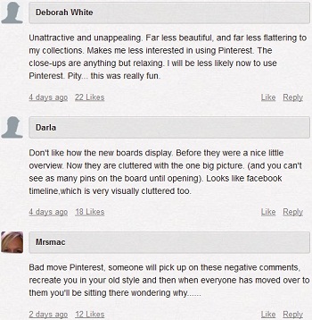
And wow, how much they hate it… When I browsed through the announcement post’s comment section, I revealed truly raging comments about the new design. And I’m not talking about just a few here-and-there negative user’s feedback. I’m talking about that 90%-95% of all comments are negative!
It looks like there is almost a consensus among Pinterest’s community that the new profile design, how to say it gently… Sucks. Here’s a small collection of comments that may reflect on the general community reaction:

Mashable runs an ongoing poll about Pinterest new profile design. So far (880 voters), most of the participants reacts negatively:
- 27.05% (238 votes)- Love it. It’s a nice upgrade.
- 25.23% (222 votes)- Hate it. Bring back the old Pinterest!
- 21.14% (186 votes)- It’s OK, but I’d prefer the old design.
- 17.27% (152 votes)- In general, it’s an improvement, but I don’t love it.
- 9.32% (82 votes)- Not sure.
Overall: 63.64% (560 votes) negative, 27.05% (238 votes) positive and 9.32% (82 votes) neutral.
I don’t think that this is what’s will stop or even slow down Pinterest growth. I also don’t think that Pinterest should act immediately and change back to the old profile design. That’s just panicking. But maybe a middle ground solution for the time being, until improving the new design, is to allow users to choose between the two designs.
Until now, Pinterest didn’t comment or released any statement about the negative users feedback. When (if) they do, I will keep you posted.