Despite increasing competition from the other social networking sites, the state of the professional social network LinkedIn among its over 160 million members (as of March) remains strong. And to keep it as such, LinkedIn makes some efforts to stay fresh and more engaging.
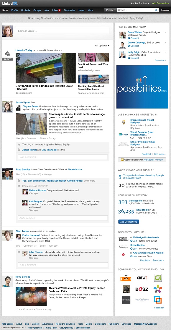
After the company introduced couple of new significant features to its social news product LinkedIn Today lately, now the public social networking company is also going after the holy grail of its web presence- The network’s shop front, the homepage. Here’s a screenshot of the new homepage design (click to enlarge):
So what are the changes on the new homepage interface?
Top Navigation Bar- Although the new navigation bar functionality remains the same as before, it did received some new stylish look with more vivid darker colors.
Main User’s News At The Top- On the top of the main news feed, LinkedIn will present the most important updates (based on the user’s connections and followed industries) in order to save time and to show what supposedly matters most to the user.
Larger Images- Images already proved to be one of the most desirable and engaging elements in any social network, so now LinkedIn follows Facebook, Google+ and Twitter steps and offers larger images directly on the news feed.
LinkedIn Today Integration- It seems that LinkedIn realizes what a good product LinkedIn Today is because it now enhances its presence on the homepage. Stories from LinkedIn Today will be featured on the main news feed and the user will be able to jump to LinkedIn Today section easily by selecting it from the “All Updates” drop-down menu at the top.
Auto-Scrolling At The Bottom- Another feature that proved to be working for other social networks arrives to LinkedIn as well. The user will be able to see more updates just by scrolling down the page without clicking on anything.
Comment Box- Below each update, the “Add a comment” box will appear instead of being hidden behind the “Comment” button on the old design. That will surely make users more willing to engage with other’s posts.
Even though LinkedIn didn’t introduced any new groundbreaking features on the new design and most of the changes appears as subtly cosmetic, it does seems that the new design is more friendly and easy to interact with. The new homepage design will roll out to all users over the next upcoming weeks.

